![]() Dracula adapted and illustrated by John Green
Dracula adapted and illustrated by John Green
 Dracula is not a easy novel to abridge, especially when one is trying to compact it to the size of a graphic novel and at the same time aiming it at a middle-grade audience, and to be honest, I can’t say this version, adapted and illustrated by John Green, succeeds all that well.
One problem is that transitions are often awkward and abrupt. For instance, we cut from a panel telling us that Jonathan realizes “his only chance of escape was to scale the castle wall,” which sets the reader up for several expectations of what’s to follow: we expect to see Jonathan still in the castle trying to get out and we expect to see him climbing upward — the meaning of the word “scale.” But the next panel (a full page one) shows him already outside the castle and climbing down the cliff outside, leaving the reader a bit flummoxed. The next page’s first panel whisks us in present tense off to England “Whitby England. Mina Murray, Jonathan Harker’s [why do we need the last name again?] fiancé, is staying with their friend Lucy Estendra” and is followed by a panel with Lucy telling Mina she thinks Mina will get a letter soon from Jonathan. The next panel shifts abruptly to a static image of another setting, “St. Mary’s Church overlooking Whitby Harbor,” and only in the next panel, the final one on the page, are we told the two women often walk there, thus explaining the purpose of that image. These sort of abrupt and/or awkward shifts happen several times over the course of the 50-page text.
 The language is a bit too simple or plain for my liking. I understand this is written for a younger audience (8 and up according to the text), but there are too few examples of the gothic style that would lend more of a sense of atmosphere to the work. Green has a few such moments, as when Lucy is first spotted in her vampire visage — “As the moonlight fell on Lucy’s face they could see that the lips were crimson with fresh blood. Her eyes blazed with unholy light” — but there were too few of them. And a shift about halfway through to present tense seemed awkward and unnecessary.
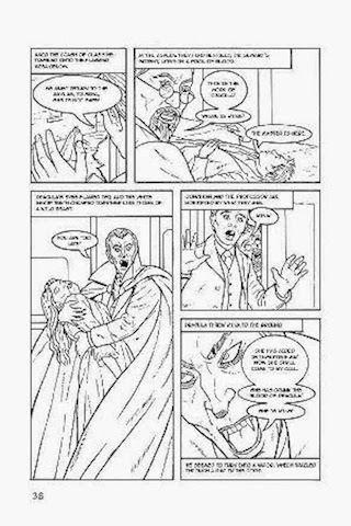
The artwork is simple, clean, and crisp and does a nice job of clearly conveying action, setting, and facial expression. Several panels are especially strong, such as one where Van Helsing and Harker confront Dracula, or when Jonathan’s coach heads into the hills. For the younger audience, the simple black lines with lots of open space will probably prove an irresistible lure to color in the illustrations themselves, making this perhaps the strongest aspect of this Dracula.
As a very simple, basic introduction to a young audience, I suppose this book suffices, but the story is, ahem, “bled” of a bit too much of its tone and atmosphere, of its haunting sense of menace and the supernatural. I would have liked to have seen what Green could have done with another 30 or so pages to flesh out the characters, enrich the atmosphere, and especially smooth the transitions. And a more vibrant sense of language would have gone well as a nice counterbalance to the clean simple lines of artwork. As it stands though, Dracula was disappointing.


It sounds like the writer got trapped in his own “dumbing down” process. I’m not sure this is a book that needs dumbing down. Aiming for an older age group, 10-13 maybe, and using the atmospheric language would have been a better choice.
Yeah, I was really hoping to give it to my 13-yr-old as an intro/sense of such an influential book, but this one, umm, “bled” too much out . . .