Joining us today is renowned artist Chris McGrath. Chris is responsible for some the best cover art in fantasy today. He’s done covers for Jim Butcher, Joe Abercrombie, Brandon Sanderson, David Gemmell, and many more. Seeing his art alone is usually enough to make me buy a book. In honor of Chris’s visit we’ll also be giving away a copy of Justin Gustainis’ Evil Ways (Chris did the cover). So with out further delay….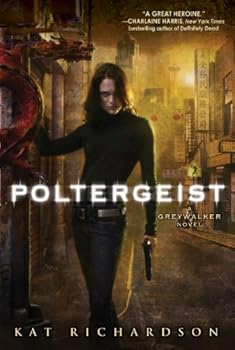
Justin: Thank you Chris for coming by. I’m really excited to have the chance to talk with you. I see your artwork everywhere and it never ceases to impress. What is the process you go through to create one of your covers? How much of the process is done on the computer? How much is done before getting to the point where you are working on the piece digitally?
Chris McGrath: After the publisher commissions me for a cover, I usually get a break down of the story from the art director and editor. They tell me what they are looking for for the cover and from there I begin the sketch phase. Sometimes a manuscript is provided, but that seems to happen less and less these days. The sketch phase is usually the hardest part for me nowadays. After you’ve done 9 years of covers it gets hard to come up with new ideas, especially when you are collaborating with a publisher. Some companies give you more freedom than others and the bigger the title, the less room you have to play a lot of the times.
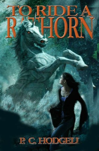 Sometimes an idea comes to me quickly because the project already has an interesting story concept and setting. Other times I go through tons and tons of sketches before I’m satisfied with something. The media for my sketches is anything from a pen drawing to using my wacom tablet in Photoshop. After the sketch is chosen by the art director I can get going on my final version.
Is it just Photoshop you use to create the final piece once your sketching is done?
I just use Photoshop. I basically use it in the same way that I use oil paint. The rules of drawing, tonal value, and color still apply. I tried to learn some 3D stuff a few years ago but it was too time consuming and really boring. For me it’s just easier to use the same process as when I was painting.
Are you actually a fantasy fan? What have you read recently that you really liked? (Or SciFi, for that matter.)
I like fantasy. I’m a huge fan of Haruki Murakami. His book Kafka on the Shore is a true work of art to me, and one of the best books I’ve read along with The Wind-Up Bird. Fantasy fans should check him out. Jeffery Ford is also awesome. I really loved The Well Built City and The Portrait of Mrs.Charbuque. Brandon Sanderson is great, too. As far as SciFi goes, Dan Simmons’ Hyperion books are right up there with Dune for me. Jeff Vandermeer‘s Veniss Underground was really beautiful. These are just to name a few. My SciFi and fantasy list goes on and on. Oh yeah, the Elric saga was an early favorite of mine.
Some really good books in your list. On the topic of favorite books, some my personal favorites are the Dresden Files series by Jim Butcher. That’s a series I believe you are familiar with. As a Dresden fan I am required by law to ask this question, which I know is one that you have gotten a lot: What’s up with the hats on Harry Dresden covers, and how much crap do Butcher fans give you over it? I’ve never seen a book signing where Jim doesn’t get asked that question. He always says the publisher has Chris put the hat on Harry.
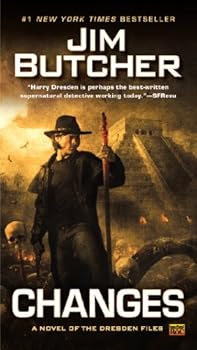 The Butcher fans have been very kind to me. They could rip me apart, but for some reason they seem happy with the covers for the most part. They have even come to accept the hat. But I do see a lot of questions on the forum regarding the hat. I try to answer that and the staff questions when I can, but it seems that the older forum members take care of that these days. I’d like to say “Thanks!” to them. It gets tiring. I know how Jim feels. But one last time ;-) yes, the publisher wanted the hat on Harry because it has a more eye-catching and iconic look, even though it was a mistake at first. But it seems to have worked and it does look more mysterious.
Thank you for answering that one. :-)) I’m sure it never gets old and, for what it’s worth, I like the hat. Speaking of cover art direction: I know that most authors don’t get much say in their cover art. In your experience when working with a publisher to do a cover, how involved does the author get?
 Most of the time the author does not have any say in what goes on a cover. Some of the bigger authors have some input and have it in their contract to do so, but most of the time it is up to marketing, the art director, and editor. In the end you want to have an attractive package to make potential buyers stop and pick it up. That’s why a lot of the time there are a lot of liberties taken with the actual story. As long as the cover captures the mood and feeling of the book, the inaccuracies of the details are OK just as long as you don’t go too far off the mark.
Have there been any particular covers that were extremely difficult for you?
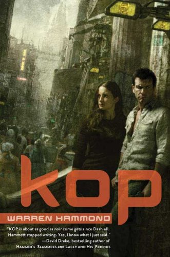
There are many. KOP and Midwinter to name a couple. The difficulty happens when I’m not totally satisfied with my approved concept, so during the time I’m working on it I try to improve on the idea and that’s when I start going in circles. Also, if I do not have a clear idea and don’t plan properly, I can get myself in trouble. The cover usually ends up taking much longer and stressing me out when this happens.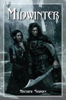
There is a ton of bad fantasy art out there, so tell me, aesthetically, what makes you cringe as an artist? And, what gives you a good shiver?
I’m not one for throwing stones, so maybe I should keep quiet on that one. But I will say that good drawing and painting skills will always attract me. When an artist does something that is tasteful and well-crafted, with a good understanding of what they are trying to achieve, it’s commendable. Class and good taste are everything.
Nice dodge. I know you have to hate those pictures of furries, the crudely-drawn man-tiger with a six-pack… everybody hates those… Anyway, I want to know a little about you before you became one of the biggest names in cover art. So, before cover art, how did Chris McGrath keep utilities paid? Was Ramen noodles a major staple of your diet? Was there any particular moment or breakthrough in your career where you finally were able to think … “I can do this for a living”?
 Yes. There were many hungry nights after college. I didn’t have my portfolio ready when I graduated, so I spent the next three years developing my portfolio in traditional media (oils). Then around 1998 I was introduced to Photoshop. I was pretty slow at painting and realized I could never make a good living at it because it took 4 to 6 weeks for me to finish one piece. So PS became more attractive to me. I spent some time learning the software on my own — basically applying the same rules of what I new about oil paints and drawing and gathering reference. It all works the same in the end. To pay my bills I gave guitar lessons and worked a couple of days a week at a doctor’s office doing medical drawings. That wasn’t too fun and I felt like it was never going to end.
Finally I finished my digital portfolio and started to show it around in 2001 (from 1998 to 2001 I did a lot of life drawing as well) I got my first job with Ace books (Penguin Putnam) and it was funny that they wanted me to do an oil painting for them instead of a digital piece. The cover’s title was called “The King”. You can find it in the Drawings section of my website. After that I got a commission from Random House for a Babylon 5 cover, so things were looking pretty good at that point, or so it seemed. Then after those two jobs I didn’t get much work. I got maybe 4 jobs my second year, then around 8 my third year. Then in 2004 I got about 16 jobs and in that mix was Dead Beat for the Dresden Files and Nightlife for the Rob Thurman series. Those covers hit the shelves later that year and after that it became a full-time job. I guess I did the right kind of cover at the right time. The urban fantasy market really took off and I was lucky enough to be doing covers for the top authors that were driving the field. So those two covers really solidified my career.
Any words of wisdom for budding fantasy/SciFi artists?
The main thing is is not to give up. It’s really tough and very trying at times before you have a full-time career. But if you really feel you have talent to make it, you should hang in there. It really does come down to that. I was very stubborn and figured I couldn’t do anything else, so I was willing to take the heat and starve a bit before it all worked out.
 I know you’re a busy man, so I won’t keep you further. Thanks again, Chris, for stopping to chat with us, it was an honor to have an artist of your caliber visit us here. If fans want to check out more of Chris’s work, or purchase prints, please head over to his website at www.christianmcgrath.com. And if you want to win a copy of Justin Gustainis’ Evil Ways, leave us a comment.


I love Chris McGrath’s art. I’ve found myself initially judging books by their covers when he’s the artist (e.g., Midwinter). I enjoyed learning about him — great interview, Justin!
Some AMAZING books were talked about in this interview! Makes me want to read all of the ones mentioned that I haven’t read.
I love the cover for Evil Ways. I find that the cover art plays a big part in my picking up a book by an author I’m not familiar with. If the cover art is cheesy or doesn’t appeal to me I probably won’t pick up the book to check it out.
I’ve always wondered how much input the artist had with respect to story details; some covers are clearly largely independent, but I’ve always had a pet peeve about those that clearly represent events and characters in the book but blatantly get basic details wrong (e.g., the color of the protagonists hair). I realize this isn’t the fault of the artist (who was undoubtedly never given this info), but as a reader I find discrepancies between the cover (including blatantly incorrect descriptions on the back) and the text very irritating.
I’m in agreement with Mike.
Mike, I’ve seen a cover in which a one-handed hero had two hands.
But then there are some books with terrible cover art that I wouldn’t have picked up if someone hadn’t told me it was good. An example is Alex Bledsoe’s The Sword-Edged Blonde. The first edition cover was awful, but the book was great.
Thanks for stopping by, Chris! I love your covers, especially on the urban fantasies; they give the books such a mysterious and gritty look.
@Mike and Kat: One of my favorites was a romance cover showing the hero embracing a beautiful blonde. Trouble was, the actual heroine of the story was a brunette and the evil villainess was a blonde…
Then there was the cover for Teresa Edgerton’s Child of Saturn some time ago, where everything on the cover was wrong except that there was a cat. Everything else was from the Fantasy Cover Cliches Kitchen Sink. Brooding sorceress in an 80s prom dress and dashing hunk in a ruffly poet’s shirt (the story was set in Arthurian times). Oh, and there was a dwarf on the cover who didn’t even appear in the story…
Lovely novel, though. I keep meaning to track down the later books in the series.
@Kat: Oh, and there’s a romance cover that’s infamous for having a
three-handed heroine.
Beautiful artwork :-))
Great interview. To me all art is mysterious as I can hardly draw stick men but it was interesting to hear about the process and who decides what the book cover should be.
And I love the cover art of the Dresden Files.
I wonder what babylon 5 cover he did?
Wow – that was fun to see the different art he’s done – that’s fabulous. Whenever I like a book’s artwork I figure it’s a fluke, but it’s nice to know that it’s probably just the same artist and he’s just good. :)
Um, that lost comment was me. Raspberry.
All his art is great! Those covers are really amazing to look at. I’m glad to here from an artist’s perspective. I always her authors asked questions about their covers, which they rarely have input in, and I wondered how much control some of the artists have.
@Kelly: The 3-handed heroine held by the hunk is hilarious! (And how do you like that alliteration?) That is one creepy chick. (And the comments on that post were really funny, too.)
I’m kind of the exception here, in that I’m not a big fan of Brandon Sanderson, but I did really enjoy your covers for the Mistborn series. I couldn’t imagine Vin any other way.
I’m with Stefan on Mistborn. It’s rare that a character on the cover matches my imagination so exactly like Chris’s Vin did.
I love the cover of on the Dresden’s book and I now look at the hat as a trademark…
I must say my favorites areMidwinter and Spectre… those really reflect the mood and the tone of the book…
Thank you for sharing so much today….
E.H>
I don’t usually take much note of the artist who does the cover drawings when looking at a book. I just either like the cover or not.
But following your interview, I think I shall start looking at who did the cover in future.
Thanks
Good interview. I’m glad to finally get the Harry hat explaination :)
Always nice to find a Dune fan. I recognized a lot of the covers. There are certain artists that always have me reaching for the book even before I see the author. I don’t know if Chris is going to come back and answer questions, but I wonder of there is a series out there he would have liked to have done the covers for.
Sarah – my name isn’t showing up again
buddyt: that’s cool!
Sarah: good question!
Thanks Justin, what a great interview and thanks Chris. It’s cool to learn more about the artist behind the art. Stephen
I have to agree, the art work is amazing! Midwinter turned out looking fabulous too, even if it was a little harder.
I was glad to hear you get a break down on the books story. That is great! I like when the covers correspond with the books themselves. Great!
Another amazing interview.
Thanks!
[email protected]
loving those covers. They rock and looks like he did covers for some of my favorite authors.
I loved the covers for the Dresden books , the Cal Leandros series and Evil Ways.
Enjoyed the interview and some good reads!
The books sounds good!
kalynnick AT yahoo DOT com
The artist for Rob Thurman’s ‘Nightlife’? OMG, I love that cover every bit as much as I loved the book itself.
leighofthestone(at)yahoo(dot)com
Chris has mentioned lots of books I now need to add to my TBR list… Both his wonderful covers and his personal favorites.
tctyATyahooDOTcom
All I can say is “I’ll be darned.”:idiot: I didn’t know that Chris did the cover art for “Mistborn”. I knew he had done “The Dresden Files” though.
Chris asked to post a response to Sarah’s question:
“I wonder if there is a series out there he would have liked to have done the covers for.”
Chris’s Response:
“The answer is the Elric series. I always loved it when I was younger and have some cool visual ideas to how I would approach it.
I have a concept of the character on my website. My second choice would be the Dune books.”
So there you have it!
This was another great interview! I have so much fun reading them and entering the giveaways. The artwork is simply beautiful!
Great interview. Cover art is so important in a book, its nice to learn more about what goes into designing it.
ajolly1456 at gmail dot com
Great interview. I don’t think that most people realize that, in general, authors have little to no say over things like cover art and book title. The authors whose publishers use Chris should feel very fortunate indeed.
Thanks for the response. I would love to see what Chris would have done with Dune. Maybe someday…
Great Interview, It was interesting for me to learn that most authors (unless well-known)really have no input about the cover art.
I really enjoyed seeing some of my favorite characters on Chris’ illustrations section of his website. I love his covers, the Dresden covers are a personal favorite, hat and all ;)
Our winner for the Justin Gustainis book is tetewa. Congrats!
Tetewa, please send your address to SB Frank or Kat.
Thanks for the interview. I went to his website and found eight books that are now on my TBR pile. So yeah, I judge a book by its cover. Which leads me to wonder where is the publishing world going with the cover being so much less important in an e-book? I read a few e-books, but still read 95% paper copies purely for the cover art. It irritates me to not be able to reference that picture on the front.
I am a big fan, I love when true art is on the cover of a book. I hate when something looks slapped together and poorly photochopped.
I love the “Midwinter” cover, but they are all beautiful….Stacy
samnstacyATmeDOTcom